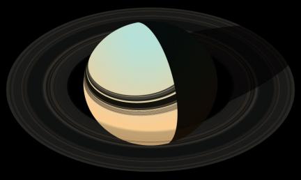
I have two really… the more detailed one is a bit photographic and i’m wondering if that is “better”? I mean, we already have photos so what’s the point? I am trying to make a nicely designed poster so should I go with the simpler (and therefore) more graphic version???
At this size you really barely see the details. Click on for larger version of each.
By the way, the rings look really different because they are supposed to look back lit in this illustration.

